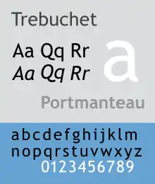
Trebuchet MS
Trebuchet MS is a humanist sans-serif typeface that Vincent Connare designed for the Microsoft Corporation in 1996. It is named after the trebuchet, a medieval siege engine. The name was inspired by a puzzle question that Connare heard at Microsoft headquarters: "Can you make a trebuchet that could launch a person from main campus to the new consumer campus about a mile away? Mathematically, is it possible and how?" Connare "thought that would be a great name for a font that launches words across the Internet".[1] Trebuchet MS was the font used for the window titles in the Windows XP default theme, succeeding MS Sans Serif and Tahoma. Released free of charge by Microsoft as part of their core fonts for the Web package, it remains one of the most popular body text fonts on webpages.[2]
 | |
| Category | Sans-serif |
|---|---|
| Classification | Humanist sans-serif |
| Designer(s) | Vincent Connare |
| Foundry | Microsoft Corporation |
| Date released | 1996 |

Distinguishing characteristics
Connare said in 2011 that "inspiration came from many sources such as the motorway signage in America and sans serif typefaces like Akzidenz Grotesk and Alternate Gothic."[3] Writing on Typophile in 2005 and also in his 1997 article on Trebuchet, he also noted that a goal was to provide a typeface that worked well onscreen while providing a contrast in texture to Verdana.[1]
Features of Trebuchet include:
- The splayed edges of the uppercase "M" which form a 10° angle with a vertical line, reminiscent of a tighter version of Futura.
- The shape of the tail of the uppercase "Q".
- The bar of the capital "A" is low.
- The shortened tails of the lowercase "e" and the numerals "6" and "9".
- The hybrid open and looped tail of the lowercase "g".
- The rounded dots above and the shapes of the lowercase "i" and "j".
- The curved tail beneath the lowercase "l".
- The dollar sign symbol "$", in which the vertical strike only appears above the top and below the bottom curves of the S.
- The ampersand "&" in the form of an "Et" ligature.
- The exclamation point "!", whose dot is large and round.
- Italic fonts incorporate italic type characteristics instead of just tilting roman glyphs, making it the first sans serif font family from Microsoft to use true italic features.
- The bold version also has some distinctive features: pointed rather than square-cut tails on lowercase "a" and "l", and slant-cut rather than square-cut ascenders.
- The en dash and hyphen are essentially indistinguishable.[4]
- The Greek letter xi "Ξ" has a vertical crossbar, reminiscent of its Phoenician root glyph samekh.
Availability
Microsoft refers to Trebuchet MS as "a good web design font", being one of their "Core fonts for the Web". Trebuchet MS is included with several products, including the Windows operating system, components of the Office productivity suite, and Internet Explorer.
In some versions of the font (those shipped with Windows 2000 and early versions of Internet Explorer), the opening quotation mark character was flipped vertically like so, ‟. This error was fixed in later versions.[5]
Trebuchet MS has been released with the Microsoft Windows operating system since Microsoft Windows 2000. The typeface has been released with Internet Explorer since version 4.0 and Microsoft Word since Word 2000. It is also included with macOS, iOS and Chrome OS.
The Trebuchet 2010 font family was introduced by Ascender Corp in July 2010 as part of the Ascender 2010 Font Pack. In addition to extensive OpenType typographic feature support, the family was extended with new black and black italic fonts. The new weights and OpenType features were developed by Ascender’s Steve Matteson and Terrance Weinzierl.[6]
Trebuchet Pro
In 2010 Ascender and Microsoft released an expanded version of Trebuchet for commercial sale. This included additional features such as small caps, stylistic alternates and text figures, as well as an additional Black weight with italic.[7][6][8]
References
- Connare, Vincent. "Trebuchet Nation". Microsoft. Retrieved 26 March 2016.
- Cranford Teague, Jason (2009). Speaking in Styles: Fundamentals of CSS for Web Designers. Berkeley, CA: New Riders. p. 226. ISBN 9780132104395.
- Connare, Vincent. "An interview with Vincent Connare". PostDesk. Archived from the original on 19 January 2015. Retrieved 18 January 2015.
- "hyphen v. en dash v. em dash". Knewance. August 22, 2010. Retrieved 2011-02-15.
- "Trebuchet double quotes". Google Groups. September 2004.
- "Ascender Releases New OpenType Font Pack for Microsoft Office 2010". Prweb.com. 2010-07-06. Retrieved 2011-05-26.
- "Ascender 2010 font pack" (PDF). PRWeb. Ascender. Retrieved 29 July 2015.
- "Ascender 2010 font pack features" (PDF). PRWeb. Ascender. Retrieved 29 July 2015.
External links
- The Microsoft typography website
- Trebuchet MS font information (Microsoft typography)
- Trebuchet Nation, a short article describing the evolution of Trebuchet MS (Microsoft typography)
- Comments by Connare on Typophile thread