Golden Arches
The Golden Arches are the symbol of McDonald's, the global fast food restaurant chain. Originally, real arches were part of the restaurant design. They were incorporated into the chain's logo in 1962, which resembled a stylized restaurant, and in the current Golden Arches logo, introduced 1968, resembling an "M" for "McDonald's". They are widely regarded to be one of the most recognizable logos in the world.


History
In 1952, brothers Richard and Maurice McDonald decided they needed a new building to house their hamburger restaurant in San Bernardino, California. They wanted this building to have an entirely new design which would achieve two goals: even greater efficiency, and an eye-catching appearance. They interviewed at least four architects altogether, finally choosing Stanley Clark Meston, an architect practicing in nearby Fontana, in late 1952. The arches had a direct bearing on the interviewing process and their choice of Meston: the first architect they interviewed objected to the arches the brothers wanted; a second wanted to change the arches; a third, prominent Los Angeles architect Douglas Honnold, said that if the brothers were going to tell him what to do they would be better off doing it themselves.[1]
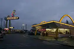
Along with their practical knowledge, the brothers brought Meston a rough sketch of two half-circle arches drawn by Richard. The idea of an arch had struck Richard as a memorable shape to make their stand more visible. After considering one arch parallel to the front of the building, he had sketched two half-circles on either side of the stand.[1] Meston, together with his assistant Charles Fish, responded with a design which included two 25-foot (7.6 m) yellow sheet-metal arches trimmed in neon, called "golden arches" even at the design stage. His design also included a third, smaller arch sign at the roadside with a pudgy character in a chef's hat, known as Speedee, striding across the top, trimmed in animated neon.
According to architectural historian Alan Hess, "Meston and Fish turned the crude half-circle suggested by Richard McDonald's sketch into a tapered, sophisticated parabola, with tense, springing lines conveying movement and energy."[1] In the same article Hess added this footnote: "Who first suggested the parabola is unclear. Richard McDonald and George Dexter, the sign contractor who fabricated the first arches, recalled that Dexter came up with the idea and added them to the plans. Charles Fish, who did the working drawings and aided Meston in the design, attributes the idea to his familiarity with the form from a school project in which he used structural parabolas for a hangar. The form was one of many advanced engineering solutions, including folded plate roofs, that were in common currency."[1]
The first franchised outlet bearing Meston's design opened in May 1953 in Phoenix, Arizona. Subsequent franchisees of the McDonald brothers were also required to use Meston's design, although Meston adapted the plans for each to the conditions and building codes of each site.[1]
In 1962, seeking to upgrade its image, the company sought a new logo. Fred Turner sketched a stylized "V", but the company's head of engineering and design, Jim Schindler, extended the "V" into an "M" resembling a McDonald's store viewed from an angle, with a red isosceles trapezoid "roof" serving as background for lettering.[2]

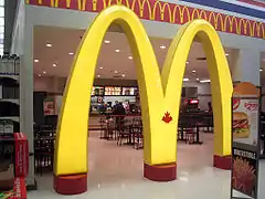
While McDonald's dropped the physical arches from nearly all of its restaurants in the 1960s, the Golden Arches have remained in the logo, and as a commonly understood term for the company. This was partially due to Louis Cheskin's argument that the arches, which he likened to "mother McDonald's breasts", had "Freudian applications to the subconscious mind of the consumer and were great assets in marketing McDonald's food."[3] In Canada, all McDonald's stores and commercials have a maple leaf in the middle of the Golden Arches.
Alan Hess summarized the arch's origin in Googie architecture and ultimate significance as follows:
The arch was conceived by businessman Richard McDonald, an untrained designer with no knowledge of erudite architectural examples. His intent was pragmatic: to be noticed. This determined its scale, position, and simple shape visible over long distances following the precedent of earlier drive-ins with which he was familiar. To McDonald, the arch was an arbitrary form, without symbolic or historic associations, which he hoped would come to symbolize McDonald's. The arches' position implies no traditional use of the arch as an entry, nor are they structural. The architect delineated this formal concept determined by the client in the energetic lines and machine-like surfaces of a popular commercial vernacular style current in the 1940s and 1950s ... Meston's design proved successful as design and icon because of, not in spite of, its commercialism.[1]
The term "Golden Arches" is sometimes used as metonym, symbolizing capitalism or globalization in phrases such as the "Golden Arches Theory of Conflict Prevention", since McDonald's is one of the more prominent American corporations that have become global in their reach (along with Coca-Cola and Nike).
Alternate versions

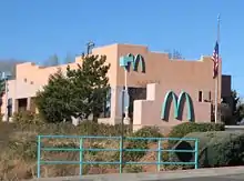
The McDonald's arches in Sedona, Arizona were made turquoise when the yellow color had been deemed by government officials to be contrasting too much against the scenic red rock.[4]
Some McDonald's signs only have one arch, such as the one at 1035 E. Main Street in Montrose, Colorado, and at 2819 S. Olive Street in Pine Bluff, Arkansas.
The McDonald's restaurant at 610 Del Monte Ave., Monterey, California, has black arches.[5]
The McDonald's in North Scottsdale on 18241 N Pima Rd also has black arches.
The McDonald's restaurant at 2172 Sunset Blvd. in Rocklin, CA has dark red arches.[6]
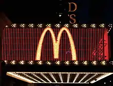
The restaurant at Champs-Elysées in Paris, France, includes a neon McDonald's sign with white arches. Also a recently built McDonald's in Bruges, Belgium, has the white arches.[7]
In 2018 and again in 2019, McDonald's turned the arches upside down on its social media accounts in celebration of International Women's Day, changing the "M" to a "W." A McDonald's franchise operated by Patricial Williams in Lynwood, California, also flipped the arches on its sign.[8][9] This prompted a mild backlash, with some arguing that the move was hypocritical due to the chain's underpaying of employees, and others observing that the "M" in the logo could just as easily stand for "men" as it could for "McDonald's."[10]
See also
- Golden Arches theory, which holds that "No two countries that both had McDonald's had fought a war against each other since each got its McDonald's"
- McDonald's sign (Pine Bluff, Arkansas)
References
| Wikimedia Commons has media related to Golden Arches. |
- Hess, Alan (March 1986). "The Origins of McDonald's Golden Arches". Journal of the Society of Architectural Historians. 45 (1): 60–67. doi:10.2307/990129. JSTOR 990129.
- Mark Hughes (4 January 2008). "Logos that became legends: Icons from the world of advertising". The Independent. Retrieved 2008-04-27.
- "Brand iconography - the secret to creating lasting brands?". Brand Strategy. February 20, 1999. Archived from the original on April 9, 2016.
- Mary Kinney. "Turquoise McDonald's arches ordered in Arizona town". AOL.
- Lane Wallace (February 13, 2010). "One-of-a-kind design for new McDonald's in Monterey". Monterey Herald. Archived from the original on February 16, 2010. Retrieved September 5, 2014.
- "Google Maps link (Photos of building exterior in listing)". Retrieved 2020-07-10.
- "Paris has what is thought to be the only McDonald's with white arches in place of their traditional golden ones". Archived from the original on 2014-09-05. Retrieved 2014-09-05.
- Kate Taylor (March 9, 2019). "McDonald's is flipping its iconic arches upside down again for International Women's Day". Business Insider.
- Abigail Hess (March 7, 2018). "McDonald's is turning its golden arches upside down to make a statement". CNBC.
- Natasha Bach (March 7, 2018). "Why McDonald's International Women's Day Celebration Isn't Going as Planned". Fortune.