Charles Joseph Minard
Charles Joseph Minard (/mɪˈnɑːr/; French: [minaʁ]; 27 March 1781 – 24 October 1870) was a French civil engineer recognized for his significant contribution in the field of information graphics in civil engineering and statistics. Minard was, among other things, noted for his representation of numerical data on geographic maps, especially his flow maps.
Charles Joseph Minard | |
|---|---|
| Born | 27 March 1781 Dijon, France |
| Died | 24 October 1870 (aged 89) Bordeaux, France |
| Nationality | French |
| Alma mater | École Polytechnique |
| Known for | Carte figurative des pertes successives en hommes de l'Armée Française dans la campagne de Russie 1812–1813 |
| Scientific career | |
| Fields | Civil engineering and information graphics |
| Signature | |
 | |
Early life
Minard was born in Dijon in the Saint Michel parish. He was the son of Pierre Etienne Minard and Bénigne Boiteux. His father was a clerk of the court and an officer of the secondary school. Minard was baptized at Saint Michel on the day of his birth.[1] He was very bright and his father encouraged him to study at an early age. At age four he learned to read and write, and when he was six his father enrolled him in an elementary course in anatomy. He completed his fourth year of study at the secondary school at Dijon early, and then applied himself to studying Latin, literature, and physical and math sciences.[1] At age 15 and a half, he was admitted to the prestigious École Polytechnique, where he studied from 1796 to 1800. He subsequently studied civil engineering at École nationale des ponts et chaussées (ca. 1800—1803).[2]:11
Work
Civil engineering
In September 1810 he was sent by the government to Antwerp and then almost immediately to the port of Flessingue. There, he solved a critical problem with a cofferdam that was leaking water faster than it could be removed. He solved the problem by using pumps driven by a steam engine, only the third time this solution had been applied to a project.[1]
He worked for many years as a civil engineer on the construction of dams, canals and bridge projects throughout Europe. On November 1, 1830, he was named superintendent of the School of Bridges and Roads, where he continued to serve through 1836. While there he was awarded the cross of the Legion of Honor. From 1839 he was inspector of the Corps of Bridges, and from 1846 inspector general and a permanent member of the Conseil général des ponts et chaussées. He retired in 1851 at the mandatory retirement age of 70, after which he dedicated himself to private research, including most famously the creation of a comprehensive body of statistical maps.[1][2]:11
Information graphics
Minard created 51 thematic maps during his lifetime and is considered "a cartographic pioneer in many respects".[3]
Early works


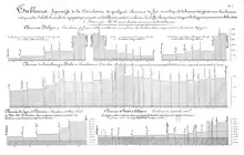
Minard's earliest known diagram is from 1825,[2]:16 but he did not start regularly producing statistical graphics until the 1840s. During this period he became interested in studying passenger and freight traffic to aid in the design of railroads. He created bar charts in which the width of each bar represents the length of the corresponding railroad segment, and its height the number of passengers. Analysis of such graphs led Minard to conclude that passengers and freight traveling for short distances between intermediate stations (and not just end-to-end traffic) were of primary importance in designing rail lines.[2]:18
Flow maps


Minard created his "revolutionary"[2]:40 first flow map in 1845 to inform the discussion about routing the rail line in the area between Dijon and Mulhouse. The map shows traffic on the pre-existing roads in the area. Two hundred copies of it were distributed to various stakeholders, and it dominated the debate among the deputies and engineers.[2]:19
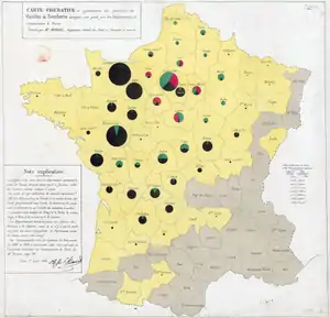
In subsequent decades Minard created tens of flow maps, illustrating subjects such as French wine exports and coal imports, British coal exports, freight traffic on French rivers and railways, European cotton imports, and international migration flows. A comprehensive portfolio of his works is today kept at the École nationale des ponts et chaussées.[2]:33
The map of Napoleon's Russian campaign
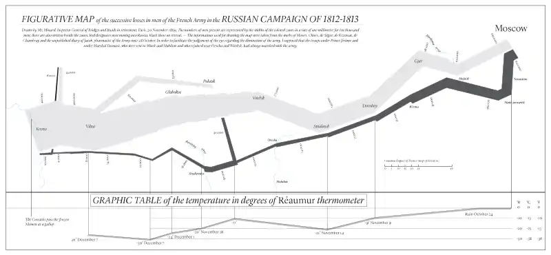
Minard is best known for his cartographic depiction of numerical data on a map of Napoleon's disastrous losses suffered during the Russian campaign of 1812 (in French, Carte figurative des pertes successives en hommes de l'Armée Française dans la campagne de Russie 1812–1813). The illustration depicts Napoleon's army departing the Polish-Russian border. A thick band illustrates the size of his army at specific geographic points during their advance and retreat. It displays six types of data in two dimensions: the number of Napoleon's troops; the distance traveled; temperature; latitude and longitude; direction of travel; and location relative to specific dates without making mention of Napoleon; Minard's interest lay with the travails and sacrifices of the soldiers.[4] This type of band graph for illustration of flows was later called a Sankey diagram, although Matthew Henry Phineas Riall Sankey used this visualisation 30 years later and only for thematic energy flow.

The original description in French accompanying the map translated to English:[5]
Figurative Map of the successive losses in men of the French Army in the Russian campaign 1812–1813.
Drawn by M. Minard, Inspector General of Bridges and Roads (retired). Paris, November 20, 1869.
The numbers of men present are represented by the widths of the colored zones at a rate of one millimeter for every ten thousand men; they are further written across the zones. The red designates the men who enter Russia, the black those who leave it. — The information which has served to draw up the map has been extracted from the works of M. M. Thiers, de Ségur, de Fezensac, de Chambray and the unpublished diary of Jacob, the pharmacist of the Army since October 28th.In order to better judge with the eye the diminution of the army, I have assumed that the troops of Prince Jérôme and of Marshal Davout, who had been detached at Minsk and Mogilev and have rejoined near Orsha and Vitebsk, had always marched with the army.
A modern redrawing of the map, translated into English:

Recognition

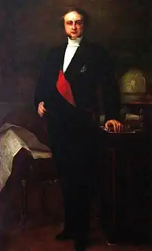
Minard's information graphics, many of which illustrated the flows of goods and people in transportation networks, were appreciated by public works officials during his lifetime. Eugène Rouher, the secretary of agriculture, commerce, and public works in the government of Napoleon III, subscribed to Minard's prints, allowing him to publish ten thousand copies of maps on various subjects. Rouher also presented Minard's maps to Napoleon III and included one of them in the background of his portrait, exhibited at the 1861 Paris Salon.[2]:26
Modern information scientists say the 1869 map of Napoleon's Russian campaign may be the best statistical graphic ever drawn.[4] French scientist, physiologist and chronophotographer Étienne-Jules Marey praised "its brutal eloquence, which seems to defy the pen of the historian".[6] Information designer Edward Tufte says it "may well be the best statistical graphic ever drawn"[7] and uses it as a prime example in The Visual Display of Quantitative Information.[8] Howard Wainer identified Minard's map as a "gem" of information graphics, nominating it as the "World's Champion Graph".[9] The Economist described it as one of "three of history's best" charts.[10]
References
- Chevallier, V. (1871). "The Life of Charles Joseph Minard (1781–1870)". Finley, Dawn (translator). From "Notice nécrologique sur M. Minard, inspecteur général des ponts et chaussées, en retraite". Annales des ponts et chaussées (in French). 2: 1–22. 1871. Posted by Edward Tufte.
- Rendgen, Sandra (2018). The Minard System: the complete statistical graphics of Charles-Joseph Minard, from the collection of the École Nationale des Ponts et Chaussées. Princeton Architectural Press. ISBN 978-1-61689-633-1.
- Arthur H. Robinson (1967), "The Thematic Maps of Charles Joseph Minard", Imago Mundi, Vol. 21, (1967), pp. 95–108
- Corbett, John. "Charles Joseph Minard: Mapping Napoleon's March, 1861". Center for Spatially Integrated Social Science. Archived from the original on 12 March 2017. Retrieved 21 September 2014.
- "Minard's Sources—from Virginia Tufte and Dawn Finley, August 7, 2002".
- Marey, Étienne-Jules (1878). La méthode graphique dans les sciences expérimentales. As cited in Rendgen (2018), p. 8.CS1 maint: location (link)
- Edward R. Tufte (2001). The Visual Display of Quantitative Information. p. 40
- "Poster: Napoleon's March". Edward Tufte. Retrieved 21 September 2014.
- Howard Wainer (1984). "How to Display Data Badly". In: American Statistician 38 (2): p. 146 (pp. 136–147).
- "Worth a thousand words". The Economist. 7 October 2013. Retrieved 25 December 2018.
Further reading
- Rendgen, Sandra (2018): The Minard System. The Complete Statistical Graphics of Charles-Joseph Minard. New York, Princeton Architectural Press, 2018, ISBN 9781616896331.
- Michael Friendly (2002). "Visions and re-visions of Charles Joseph Minard." Journal of Educational and Behavioral Statistics. 27 (1), 31 – 52.
- Minard, Charles-Joseph. Des Tableaux graphiques et des cartes figuratives, par M. Minard,... Thunot, 1862.
- Robinson, Arthur H. "The thematic maps of Charles Joseph Minard." Imago Mundi 21 (1967): 95-108.
- Edward R. Tufte (2001). The Visual Display of Quantitative Information (2nd ed.). Graphics Press. ISBN 0-9613921-4-2.
- Wainer, Howard. "Visual Revelations: A Graphical Legacy of Charles Joseph Minard: Two Jewels from the Past." Chance 16.1 (2003): 58-62.
- The Underappreciated Man Behind the “Best Graphic Ever Produced: He’s known for his acclaimed depiction of Napoleon’s ill-fated invasion of Russia. But Charles Minard was full of innovative visualizations. National Geographic, By Betsy Mason MARCH 16, 2017.
- Finding Minard, March 16, 2017.
- Charles Radiguet is the great-great grandson of Charles Joseph Minard. He visited the SS Nomadic in Belfast, which was named after Charles Joseph Minard (https://twitter.com/ssnomadic/status/760177082370449409?lang=en)
External links
| Wikimedia Commons has media related to Charles Joseph Minard. |
- Comprehensive collection of digitized works by Minard (writings and maps), École Nationale des Ponts et Chaussées
- Background on Minard's graph including original sources, Edward Tufte
- The Graphic Works of Charles Joseph Minard, Michael Friendly, York University (Ontario) Department of Psychology
- Minard biography, Michael Friendly
- Re-Visions of Minard, Michael Friendly
- Grime, Dr. James. "The Greatest Ever Infographic" (video). Brady Haran. Retrieved 3 April 2014.
- "Digital collection of cards and documents of Charles-Joseph Minard, kept in École nationale des ponts et chaussées's library". École nationale des ponts et chaussées. Retrieved 24 June 2016.