Trinité (typeface)
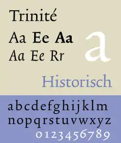
Trinité is a serif typeface designed by Dutch type designer Bram de Does. He worked on the design from 1979 to 1982.[1] In 1991, he received the H.N. Werkman Prize for the design.[2]
 | |
| Category | Serif |
|---|---|
| Classification | Humanist serif |
| Designer(s) | Bram de Does |
| Foundry | The Enschedé Font Foundry |
History
Trinité was originally designed for phototypesetting machines. In 1978, the printing office Joh. Enschedé replaced their phototypesetting machines (with Autologic machines), for which they wanted to adapt Jan van Krimpen's typeface Romanée. The company consulted with De Does, who was against it. He feared that Romanée would lose its character in the translation from metal movable type to phototype, specifically because Romanée was not a single font but several versions, one for each point size, which would not be possible to preserve in phototype. He considered commissioning a new typeface, specifically designed for the new technology, a much better idea. Although it was not his intention, Enschedé invited him to design this new typeface.
Characteristics
The name Trinité refers to the fact that the font family contains three variants, each with different lengths of ascenders and descenders. To design the typeface, De Does studied different solutions to increase harmony on the printed page, and achieve better legibility. He made a list of design principles for an ideal text typeface. These principles were divided into four categories, which according to him could apply to every human production; functionality for the user (legibility in the case of typefaces), harmony (for aesthetics reasons), practical ergonomic applicability for the manufacturer (the type foundry and compositor) and originality (‘because otherwise there is no use in making the thing’[3]). De Does was of the opinion that harmony on the printed page had been the most powerful in the early Renaissance incunables, and that they present a stronger, more regular overall image. De Does identified two factors that he thought contributed to this impression: the fact that the characters are subtly slanted, and that the serifs are slightly longer towards the right. He therefore decided to introduce these kinds of features into Trinité as well. All characters have an angle of about 1 degree and firm, asymmetric foot-serifs that are calligraphic in shape. The harmony of words was also increased by what he called 'functional swing', meaning that there is not a single straight line in Trinité. This made the typeface 'systematically sloppy'. Although some of these details were inspired by techniques used in Renaissance printing types, De Does missed them in the typefaces that were available for the composition equipment he had at his disposal. Reintroducing them to a new typeface created specifically for this equipment was how he wanted to be original, or as he labeled it; historical originality.
Digital typography
Trinité was originally published as an Autologic typeface in 1982. However, at the end of that decade, when De Does had already left the firm, Enschedé once again switched typesetting machines (this time the digital Linotronic system) and only kept the old one because of Trinité. Being an important business asset for the firm, they commissioned De Does and Peter Matthias Noordzij (the designer of PMN Caecilia) to produce digital PostScript fonts of Trinité, using Ikarus M. To distribute the typeface, Noordzij proposed starting a small-scale digital type foundry, The Enschedé Font Foundry (TEFF), on which they released Trinité in 1992.
References
- Jan Middendorp, Dutch Type, 010 Publishers, Rotterdam (2004), p. 160.
- The Enschedé Font Foundry (1995). "Bram de Does". Retrieved 2 February 2010.
- Bram de Does, Romanée en Trinité: Historisch origineel en systematisch slordig, De Buitenkant, Amsterdam (1991), pp. 17−20.