Rufer House
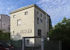
The Rufer House at Schließmanngasse 11 in Vienna, was designed by architect Adolf Loos in 1922 for Josef and Marie Rufer. It is considered to be the first example of the new style of Raumplan. Raumplan was very different from its predecessor Free Plan in its internal spatial organization. While not as well known as some of other of Loos’ houses, this set the precedent for his later designs.
| Rufer House | |
|---|---|
 | |

| |
| General information | |
| Architectural style | Raumplan |
| Location | Vienna, Austria |
| Coordinates | 48.1894°N 16.2907°E |
| Completed | 1922 |
| Technical details | |
| Structural system | Bearing Masonry |
| Design and construction | |
| Architect | Adolf Loos |
Basic design
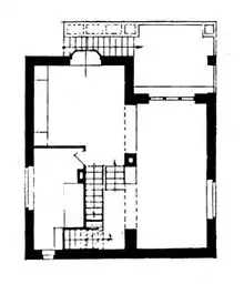
The house is an almost cube like volume and the internal space is 10m by 10m. The exterior walls are load bearing leaving the interior walls to partition space. A central column runs through the house hiding the plumbing and also acting as a framing device on the second floor. This central column is a grounding agent, connecting the entire house and acting as a point of reference.
Rufer House and Raumplan
Raumplan sets out to emulate a natural landscape internalized through interconnecting volumes and the Rufer House does this through its multilevel organization on a single floor. While both the first and second floors of the house have this split-level distinction, the second floor is the one best seen as Raumplan. The second floor is made up of the living area on the lower level and the dining room on the higher level. The dining area is seen as a part of the living area and thus its volumes intersect. The level change gives the dining room volume a distinction from the living room volume. A small staircase connects the two levels. The central column of the building, while creating the distinction between the two volumes, also frames the space creating a diagonal view through the house between the lower and upper levels of the floor. The private study found on this floor is seen as separate. It is a solid volume that is disconnected from the continuous spaces of the living and dining areas and grounds the floor to the exterior walls. Finally, the terrace that connects to the living room is an outdoor space that was carved out from the interior space and is overhung by the floor above it. This suggests that it is both an outdoor and indoor space and blurs this threshold.
Exterior
Loos was very adamant about the pure form of the cube above all and decoration is kept to a bare minimum. The walls are a stark white and the windows frames contain the least amount of structure. This, however, is balanced by the frieze and cornice that runs along the top of the building, and a replica of some portions of the Parthenon frieze positioned on the street side low enough for viewing. The frieze and cornice tie together the entire building while still contributing to the austere nature and seeming almost invisible. The Parthenon replications are seen to balance out the voids and surfaces on the building (windows and walls) while at the same time balancing the purist abstraction of the ideal cube form. The panels tie in the history of western architecture and seem to project the idea that Adolf Loos was a classical architect and not a radical.
Another key part of the Rufer house is the seemingly random arrangement of windows. With the blank white walls giving no distraction, the most noticeable aspect of the house are the windows. While from the exterior the windows make no sense to the casual viewer, from the interior the windows make perfect sense. These interiorly programed windows give light and views where they make sense on the inside. They continue the diagonal view through the second floor previously mentioned and give light where needed in the denser spaces.
Gallery
 |
 |
 The parthenon fries |
Bibliography
- Adolf Loos, Le Corbusier. RaumPlan Versus Plan Libre.010 Publishers, Rotterdam 2008.
- Cynthia Jara. Adolf Loos's "Raumplan" Theory. Journal of Architectural Education (1984-), Vol. 48, No. 3 (Feb., 1995), pp. 185–201