Lucian Bernhard
Lucian Bernhard (March 15, 1883 – May 29, 1972) was a German graphic designer, type designer, professor, interior designer, and artist during the first half of the twentieth century.

Career


He was influential in helping create the design style known as Plakatstil (Poster Style), which used reductive imagery and flat-color as well as Sachplakat ('object poster') which restricted the image to simply the object being advertised and the brand name. He was also known for his designs for Stiller shoes, Manoli cigarettes, and Priester matches.[3]
Though he studied briefly at the Akademie in Munich, he was largely self-taught. He moved to Berlin in 1901 where he worked as a poster designer and art director for magazines. In 1920, he became a professor at the Akademie der Künste until 1923, when he emigrated to New York City. In 1928, he opened the Contempora Studio with Rockwell Kent, Paul Poiret, Bruno Paul, and Erich Mendelsohn where he worked as a graphic artist and interior designer. In Germany, Bernhard's typefaces were initially favored by the Nazi Party, but were later banned under the mistaken assumption that he was Jewish (largely due to his Jewish-sounding birth name).[4] Later in life, Bernhard worked primarily as a painter and sculptor until his death on May 29, 1972.[5]
Personal life
He was born in Stuttgart, Germany, on March 15, 1883, as Emil Kahn, but changed his name to his more commonly known pseudonym in 1905. His first name is often spelled Lucien.
Lucian Bernhard was the father of the photographer Ruth Bernhard.
Typefaces


- Bernhard Antiqua (1912, Bauer)
- Bernhard Fraktur (1912–22, Bauer)
- Bernhard Privat (1919)
- Bernhard Brush Script (1925, Bauer)
- Bernhard Cursive + Bold (1925, Bauer), also known as Madonna and Neon Cursive, also cast as "Madonna Ronde" by Stephenson Blake
- Lucian series (1925, Bauer), later digitized as Belucian by Font Bureau
- Lucian + italic also known as Graphic Light
- Lucian Bold + italic also known as Graphic Bold
- Bernhard Schönschrift (1925–28)
- Bernhard Bold Condensed (1926, Lanston Monotype)
- Bernhard Handschrift (1928, Bauer)
- Bernhard Roman + Italic (Bauer)
- Bernhard Fashion (1929, ATF and Intertype)
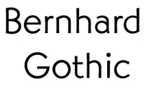
- Bernhard Gothic series (ATF)
- Bernhard Gothic Light (1929)
- Bernhard Gothic Medium (1929)
- Bernhard Gothic Light Italic (1930)
- Bernhard Gothic Heavy (1930)
- Bernhard Gothic Extra Heavy (1930)
- Bernhard Gothic Medium Condensed (1938)
- Lilli (1930, Bauer)
- Negro (1930, Bauer), later digitized as Berlin Sans by Font Bureau
- Bernhard Booklet + Italic (1932, ATF)
- Bernhard Tango (1934, ATF)
- Bernhard Tango Swash Capitals (1939, ATF), known in Europe as Aigrette
- Bernhard Modern series (ATF)
- Bernhard Modern Roman (1937)
- Bernhard Modern Bold (1938)
- Bernhard Modern Bold Italic (1938)
- Bernhard Modern Condensed (1938)
Types Inspired by Bernhard
- Berthold Block (1908, Berthold), drawn by Hermann Hoffmann, has been said to have been inspired by the deliberately wobbly letter-forms on Bernhard's posters of the time.[6][7]
- Concerto Rounded SG (2002, Spiece Graphics), designed by Jim Spiece in 2002, based on a 1920s concert program lettered by Bernhard.[8]

References
- Rollins, Carl Purlington American Type Designers and Their Work. in Print, V. 4, #1.
- Jaspert, W. Pincus, W. Turner Berry and A.F. Johnson. The Encyclopedia of Type Faces. Blandford Press Lts.: 1953, 1983. ISBN 0-7137-1347-X.
- MacGrew, Mac, "American Metal Typefaces of the Twentieth Century," Oak Knoll Books, New Castle Delaware, 1993, ISBN 0-938768-34-4.
- Friedl, Ott, and Stein, Typography: an Encyclopedic Survey of Type Design and Techniques Throughout History. Black Dog & Levinthal Publishers: 1998. ISBN 1-57912-023-7.
- Heller, Steven. "Lucien Bernhard". AIGA. Retrieved 6 September 2017.
- Philip B. Meggs; Alston W. Purvis (14 April 2016). Meggs' History of Graphic Design. John Wiley & Sons. p. 266. ISBN 978-1-119-13620-0.
- "Lucien Bernhard". Schoolnet.Uk. Archived from the original on 2010-03-09. Retrieved 2010-03-09.
- Heller (2008), Iron Fists: Branding the 20th-Century Totalitarian State, p. 50.
- Friedl, Ott, and Stein, pp. 124–5.
- David Consuegra (2004), American type design and designers, Allworth Communications, Inc. ISBN 1-58115-320-1, p. 78
- Ulrich, Ferdinand. "From Condensed Light to Extended Ultra". FontShop. Retrieved 19 August 2017.
- "Concerto Rounded SG™ - Webfont & Desktop font « MyFonts". myfonts.com.
External links
- Long, Christopher ed "Design and reform: The making of the Bauhaus." (Magazine) The Antiques Magazine (2009)
- AIGA Medalist article “Proto-Modernist” by Steven Heller
- Art Directors Club biography and images of work
- Touring exhibition "Lucian Bernhard. Advertising and Design at the Dawn of the 20th Century"
- Plakatstil
- Plakatstil (International posters)