Galliard (typeface)
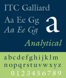
Galliard is the name of a serif typeface designed by Matthew Carter and issued in 1978 by the Mergenthaler Linotype Company.[1]
 | |
| Category | Serif |
|---|---|
| Classification | Old-style |
| Designer(s) | Robert Granjon Matthew Carter |
| Foundry | Linotype International Typeface Corporation |
| Date released | 1978 |
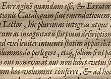
Galliard is based on the sixteenth-century type of Robert Granjon.[2] According to Alexander Lawson, "The name Galliard stems from Granjon's own term for an 8-point font he cut about 1570. It undoubtedly refers to the style of the face, for the galliard was a lively dance of the period."[3] Explaining what drew him to Granjon's work, Carter wrote on some of his more characteristic letterforms: "looking at them, adjectives like 'spirited, 'tense' and 'vigorous' come to mind...it is easy to admire Granjon's work."[1]
Mike Parker, Director of Typographic Development at Mergenthaler Linotype, had been inspired by seeing the types of Granjon at the Plantin-Moretus Museum in Antwerp.[4][3] Matthew Carter, who joined Mergenthaler Linotype as a typeface designer in 1965, was also an admirer. His father, Harry Carter, had worked to itemise the Museum's extensive collection of sixteenth-century punches and matrices in the 1950s, with his son occasionally helping.[5][6][7][8] Work continued on the typeface, sporadically, through the 1960s and 1970s. The typeface was released in 1978. With a glittering, crisp design, Galliard has been used both for body text and for headings. Galliard is notable for its 'pelican-beak' letter 'g', based on Granjon's Double Pica italic of 1570.[2]
ITC Galliard (1978, 1982)
It is a version re-issued by International Typeface Corporation after Mike Parker had given ITC exclusive rights to Galliard. Matthew Carter drew the four roman weights and complementary italic designs while at Mergenthaler Linotype, and a suite of small caps for the Roman and Bold weights. ITC Galliard was introduced by Mergenthaler Linotype Company in 1978, with public availability for ITC subscribers beginning on 1982-01-15 (as announced in December 1981 (volume 8-4) issue of U&lc magazine).[9]
The family includes 8 fonts in 4 weights and 1 width, with complementary italics. OpenType features include fractions, ligatures, ordinals, superscript.
ITC Galliard Pro (2010)
It is a version of ITC Galliard with characters that support Central European languages.
OpenType features include case sensitive forms, numerators/denominators, fractions, ligatures, lining/old style/proportional/tabular figures, localized forms, ordinals, scientific inferiors, superscript, small caps, diphthongs, stylistic alternates (set 1).
ITC Galliard eText (2013)
It is a version of ITC Galliard optimised for on-screen use, designed by Carl Crossgrove. Changes include increased lowercase heights, increased inter-character spacing, more open counters, adjusted thicks to thins ratio.[10]
The family includes 4 fonts in 2 weights (regular, bold) and 1 width, with complementary italics. Character set support include. OpenType features include case sensitive forms, fractions, ligatures, lining/old style figures, localized forms, ordinals, small caps. Character set supports include Adobe Western 2.
Reception
Galliard has robust strokes, but also sharp details and incisive contrast between thick and thin strokes. According to Lawson, "While the designers of the regenerated Garamonds were attempting to bring fidelity in their copies, Carter preferred simply to bring to Galliard his interpretation of the spirit of a Granjon original...Galliard thus possesses the authentic sparkle that is lacking in the current Garamonds."[3]
Usages
Galliard was a typeface used in the graphic identity and standards of Yale University until it was replaced in 2007 by Matthew Carter's Yale typeface which was itself inspired in part by Galliard.
Galliard was one of twenty-three typefaces acquired by the Museum of Modern Art in 2011 and subsequently exhibited in Standard Deviations.
Galliard is the house typeface of The New Criterion and of the Library of America series.
Galliard is the font found on the official logo of Baylor College of Medicine.
See also
- Bigelow, Charles, Galliard, in Fine Print on Type, Charles Bigelow, editor, Bedford Arts, 1989, pp. 13–16.
- Lawson, Alexander, Anatomy of a Typeface, Godine, 1990, pp. 141–146.
References
- Carter, Matthew (1985). "Galliard: A Revival of Types of Robert Granjon". Visible Language. 19 (1): 77–98. Retrieved 19 May 2017.
- Vervliet, Hendrik D.L. (2008). The Palaeotypography of the French Renaissance: Selected papers on sixteenth-century typefaces. 2 vols. Leiden: Koninklijke Brill NV. pp. 215–230, 321–2, 356. ISBN 9789004169821.
- Lawson, Alexander, Anatomy of a Typeface, Godine, 1990.
- Bigelow, Charles, Galliard in Fine Print on Type, Charles Bigelow, editor, 1989.
- "Archived copy". Archived from the original on 2012-06-20. Retrieved 2012-06-20.CS1 maint: archived copy as title (link)
- Carter, Harry (2002). Mosley, James (ed.). A View of Early Typography up to about 1600. London: Hyphen Press.
In 1954 Carter was persuaded...to take up the appointment of Archivist at the Oxford University Press...a part of Carter's brief was therefore to look into [the Plantin-Moretus Museum's] collections...it had gradually become known that Plantin's stock of punches and matrices had also survived intact...Carter became a member of the small team of researchers who performed the task of sorting and cataloguing the materials...his experience at Antwerp involved handling punches...and original matrices, from which he cast sample types, using the traditional hand mould.
- Hoefler, Jonathan. "Reconstructing Harry". Hoefler & Co. Retrieved 14 October 2017.
- Mosley, James (2003). "Reviving the Classics: Matthew Carter and the Interpretation of Historical Models". In Re, Margaret (ed.). Typographically Speaking: The Art of Matthew Carter (2. ed.). New York: Princeton Architectural. pp. 31–6. ISBN 9781568984278.
- U&lc. VOLUME EIGHT, NUMBER FOUR, DEC. 1981, pages 28-33
- eText Typefaces: Typefaces for High-Quality e-Reading Experiences
- Clusius, Carolus (1611). Atrebatis cvrae posteriores, seu, Plurimarum non antè cognitarum, aut descriptarum stirpium, peregrinorumq́ue aliquot animalium. Antwerp: Officina Plantiniana. Retrieved 5 March 2019.
- Blokland, Frank E. "An Italic for Uccello [Comments on TypeDrawers thread]". TypeDrawers. Retrieved 5 March 2019.
